
Effortless color pairings for a stylish living room
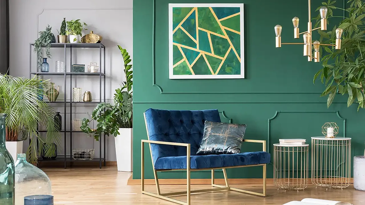
Balanced, stylish living room palette starts with color pairings that feel cohesive, calm, and effortless. Choosing combinations that naturally complement your space helps everything from furniture to décor feel intentional, even if the room has been updated over time. The right pairings guide the mood, shape the flow, and create a polished look without adding extra work.
Picture a Saturday afternoon when sunlight hits your accent chair just right, and those well-chosen tones make the entire room feel curated instead of chaotic. That is the power of combinations that support style without creating decision fatigue.
Color Scheme Ideas: Which Colors Make a Small Living Room Look Larger?
Colors that reflect light create the strongest sense of spaciousness in a small living room. Soft whites and light grays brighten the walls and reduce visual shadows, which helps the room feel more open.
These shades work well because they allow natural and artificial light to move easily across the space, giving the impression of added square footage without changing the layout.
Pairing these lighter tones with gentle accent colors can widen the effect even further. Hues such as:
- Muted blue
- Warm sand
- Soft blush
- Warm linen
- Light peach
Add subtle dimension without weighing down the palette. Consistency also matters. Keeping trims and larger furniture pieces within a similar light range avoids strong breaks in color that might visually shrink the room.
Can Bold and Neutral Colors Work Together in the Same Living Room?
Bold and neutral colors can work together effectively when the palette is planned with clear balance in mind. It's the best way to incorporate stylish pink sectionals without creating your own Barbie Dream House.
Neutrals such as:
- Cream
- Taupe
- Soft gray
- Warm beige
- Pale stone
Offer a quiet backdrop that keeps the room grounded. Bold colors introduce personality without overwhelming the space. This approach works particularly well in living rooms where homeowners want a single statement element supported by a calm, cohesive foundation.
Using bold colors sparingly helps maintain harmony. A sofa, accent wall, or oversized artwork can serve as the focal point, while neutral tones guide the rest of the palette through rugs, curtains, and additional seating.
Brown and White
Brown and white form a classic pairing that brings warmth and clarity to a living room. Brown anchors the space with its natural depth, drawing inspiration from wood, leather, and organic textures.
White introduces brightness that keeps the palette crisp and open, creating a balanced look that feels both inviting and refined. The combination works well in modern, traditional, and transitional homes because it adapts easily to a wide range of materials and decor styles.
This palette shines when the two colors play complementary roles. Brown elements such as:
- Wood furniture
- Woven baskets
- Leather seating
- Textured side tables
- Rustic shelving
Establish structure and warmth, while white walls, curtains, or area rugs make the room feel spacious and clean. The contrast highlights architectural details without creating harsh lines, especially when warm white tones are used. Adding subtle accents in natural fibers, greenery, or soft metallic finishes helps unify the space.
Greens and Yellows
Greens and yellows create a lively palette that brings energy into the living room without overwhelming the space. Green offers a natural, grounding presence inspired by foliage and outdoor landscapes, while yellow introduces brightness that lifts the entire mood of the room. This pairing suits homeowners who want a fresh, cheerful atmosphere that still feels polished and well-balanced.
These colors work best when applied in complementary roles. Green can serve as the steady base through rugs or wall paint, while yellow appears in smaller accents such as pillows, vases, or artwork.
The two colors share warm undertones in many variations, which helps them blend seamlessly even when mixed with different materials like wood, linen, or woven textures.
FAQs
What Colors Pair Well With Natural Wood Tones?
Natural wood tones work well with colors that highlight their warmth and grain. Soft whites, warm grays, and muted greens complement most wood finishes because they create balance without competing for attention. These colors help the natural variation in the wood stand out, which gives the room a cohesive, inviting feel.
Earthy accent colors such as:
- Terracotta
- Olive
- Sand
- Burnt sienna
- Warm clay
- Golden wheat
Also pair seamlessly with wood, especially in living rooms that feature lighter oak or richer walnut. These tones echo the natural qualities of the material and create a palette that feels both harmonious and adaptable to different decor styles.
Which Colors Help Hide Everyday Wear?
Colors with mid-tone depth tend to hide everyday wear better than very light or very dark shades when it comes to modern interior design.
- Soft browns
- Warm grays
- Muted greens
- Slate blues
Generally disguise small scuffs, dust, and natural texture changes that appear over time. These colors create a balanced backdrop that does not spotlight minor imperfections.
Patterns and textured materials add even more concealment. Upholstery fabrics with subtle weaves and throw pillows with slight variation in tone can mask regular use while still contributing to a cohesive palette. Choosing these tones for high-traffic areas keeps the living room looking consistent between cleanings if you choose the right home makeover inspiration.
How Can I Bring in Seasonal Colors Without Repainting?
Seasonal colors can be introduced through items that are easy to swap out as the weather changes. Textiles offer the most flexibility, so:
- Pillows
- Throw blankets
- Area rugs
- Ceramics
Are often the first places homeowners experiment with interior design trends. Wall art and tabletop décor provide additional ways to shift the tone of the room without altering the underlying paint.
Plants and natural elements also help mark seasonal changes. Bright greenery works well in spring and summer, while branches, dried arrangements, and warm-toned florals support fall and winter schemes. Rotating these smaller pieces allows you to refresh the atmosphere of the living room while keeping the main color palette consistent year-round.
Stylish Living Room Colors: Try These
With these stylish living room colors, your home will look amazing in no time.
Do you need more home redesign advice? Check out some of our other helpful posts ASAP.
This article was prepared by an independent contributor and helps us continue to deliver quality news and information.